When running a popular forum, there is usually a desire to create a LOT of sticky threads. Some popular examples:
- Introduce yourself here!
- Forum rules and FAQs – READ BEFORE POSTING!
- Site announcements and updates
- The Idiot’s Guide to using this site
- List of informative links
We find that some sticky threads attract few posts. Other sticky threads are simply ignored by newbies who prefer to dive into the fray immediately. This behavior makes us wonder. Does it make sense to have a long list of threads taking up prime real estate at the top of your board?
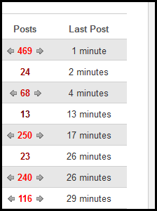
We don’t think so. We prefer no sticky threads at all. This ensures that the hottest content always rises to the very top of the page.
However, we admit there are instances when a single sticky thread is warranted and there are even times when it makes sense to have multiple sticky threads. For example, let’s say you have a FAQ thread as a sticky thread and you’re running a contest and want to promote the contest too. That’s an understandable scenario, as long as the contest thread gets demoted when the contest is over.
By an large, we have found that users strongly prefer to have the hottest and most recent content at the very top of the page. Maybe your forum has a long list of sticky threads, some of which have not had a new post in a few months. Ask yourself if they are absolutely critical to using your forum or if you would be better served by letting the hottest content rise to the top of the thread list.